

John Goodall, Head of Private Client Research
“The US equity markets have continued to perform strongly with both the Standard & Poors 500 Index and the NASDAQ Composite Index close to all-time highs. For investors, the outlook is more important than past performance: are these historic returns sustainable? We consider a range of three different indicators which provide some clues about what to expect.”
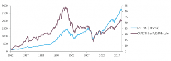
Shiller P/E Ratio
A simple trailing P/E ratio is calculated by comparing the current price with the latest earnings per share. For an index, it is calculated by averaging individual constituents. The Shiller P/E improves on this metric by averaging earnings over a trailing ten year period and adjusting the results for inflation. Arguably this provides a more accurate picture of long-term earnings because it reduces distortions caused by the volatility of earnings from one year to the next. As confidence in the market increases, investors are willing to pay a higher level for future earnings, pushing the ratio higher. The latest reading is 31.8x, below the all-time high of 44.2x, yet well above the long run average of 16.9x (from 1881 to 2018).
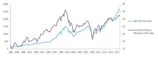
Household Equity Allocation
The proportion of total US household financial assets invested in equities is strongly correlated with equity performance. The ratio rises as investors become more confident in the economic outlook (and as valuations increase). The more the ratio increases, the less scope there is for households to invest.
This creates a natural limit to price appreciation. The ratio peaked in 2000 and 2007, effectively in line with the major market tops. Currently it stands at 32.2%, in comparison to a peak of 36.0% and long run average of 22.5% (from 1952 to 2018).
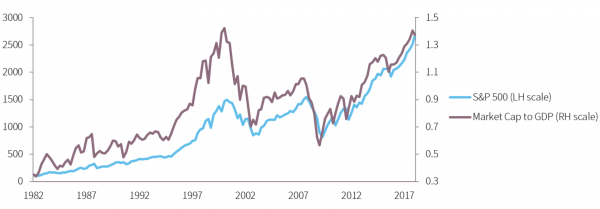
Market Cap to GDP
Of all the metrics presented, the market cap to GDP has the strongest correlation to equity market returns. It is favoured by Warren Buffett as the one single indicator that gives the best overall guide as to where current valuations stand in relation to overall economic activity. One would expect valuations to rise broadly in line with economic output. This indicator demonstrates whether valuations are relatively expensive or inexpensive in comparison. The ratio previously peaked in 2000 and 2007 ahead of the stock market. The current level of 1.37x compares to an all-time peak of 1.43x and a long run average of 0.76x (from 1971 to 2018).
Conclusion
The three ratios, which are all strongly correlated to equity market performance, all show that the US market was expensive in 2000 and cheap in 2009. Now they indicate that the market looks relatively expensive compared to historic levels. On balance the evidence shows that a focus on value in the US equity market is likely to prove a sensible approach in the current climate.
Data sources:
Shiller P/E: Capital IQ, www.econ.yale.edu/~shiller/data/ie_data.xls
Household Equity: Capital IQ, Federal Reserve Bank of St. Louis
Market Cap to GDP: Capital IQ, Federal Reserve Bank of St. Louis